PREY POSTERS
- ANYA CINNAMON MACHIN

- Apr 25, 2019
- 2 min read
Updated: May 3, 2019
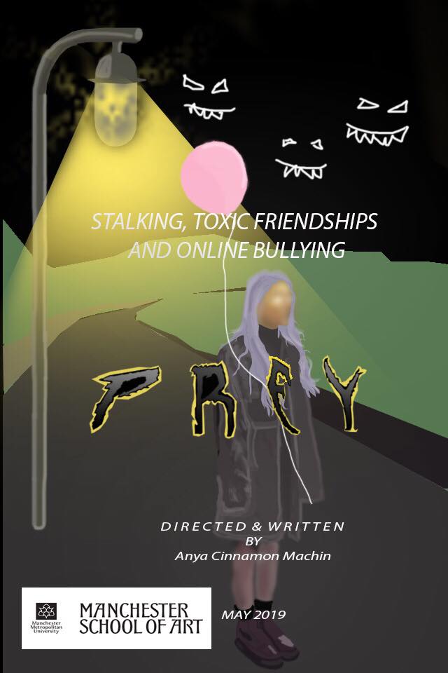
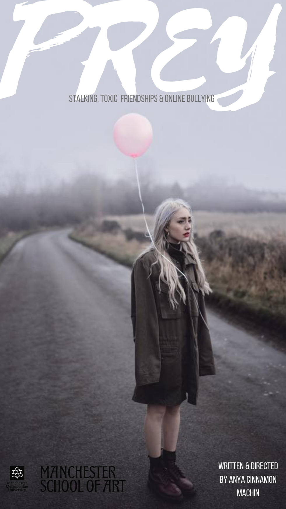
Creating the poster for me has been a really interesting journey, at the start of the academic year I got quite into graphics and poster design so when it came to our graduate film I knew I was going to be playing around a lot with different ideas, styles and framings for posters. Before production started I already knew the image in which would be the cover photo, a while back myself and a talent photographer fro my local town did a photoshoot, we used the desolate yorkshire landscape, the old mining town in the backdrop. As soon as I had my graduate film idea this photo kept springing t mind, it captured everything I wanted to say about my town, its dead, its a shit hole, get out! while also having quite a haunting feel to it something I wanted to be shown, the balloon symbolising letting go.
As you will see most of the designs for logos I made were pretty similar Text wise although I did a lot of work on framing text and the placement of certain things, I did multiple different versions until I wanted to get an outsider from the film to have the image and synopsis and put there own touch onto it, I wanted to get a whole new perspective on the poster, with this in mind i got in contact with a talented graphic designer and filmmaker who I studied with in college, he agreed to design me a poster, it currently in progress although i'm really optimistic to see what he has coming up with, The poster that he created is the third version I've added below. Up to now i'm feeling i'm going to go with option one and three.
Photography by: Ryan Lee Turton


Comments